Arshake is delighted to announce the launch of Intervalli tipografici, the eighth site-specific project created for the magazine’s banner by Antonio Pace in collaboration with visual artist Cristian Rizzuti. Known and renowned for his graphical and typographical artwork, for some years Pace has dedicated himself to a personal and authorial creative production, a modern synthesis of graphics, design, art, architecture, writing and visual poetry. Until now his works have addressed the transcodifcation of language into new archi-graphic type forms in a return to the archetype of the sign. The Outlines exhibition held in Rome’s Galleria Curva in 2015 was the first formalised expression of this typographical philosophy in physical space.
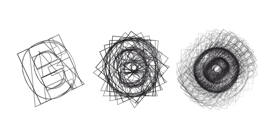
Intervalli tipografici continues this journey in liquid space. It all began with the construction of a moving 3D object, made by superimposing typographical characters concentrically. The process leading up to the project’s launch gradually deconstructed the object in order to return it to the minimal nature of the sign. The frenetic timescale of information intertwines with the slowness of “typographical meditation” in which the noise of complexity, where the visual and sound properties of characters become confused, dissolves into the linearity of the sign. The process is divided into fragments of time, which the software broadcasts on the banner on the basis of a randomised logic each time the site is accessed. The work moves to a typographical rhythm which draws us into the mysteries of the archetype. What we can do is listen.
Antonio Pace, Intervalli Tipografici, typographic work and video realized in collaboration with Cristian Rizzuti, using exclusively letters of monotype’s «neue haas grotesk»
Antonio Pace was born in Rome is 1968. Having graduated in Visual Communication with specialisation in Grafikdesign from the Hochschule für Gestaltung Offenbach am Main [University of Art and Design, Frankfurt am Main], he opened a graphic design studio in Frankfurt. Since 1999 he has worked with Linotype designing font characters. The year 2000 saw the release of Linotype Gianotten, a Bodoni-style typeface, designed on the basis of originals preserved in Parma’s Museo Bodoniano. Antonio Pace is the founder of AReA Deutschland (Frankfurt) and a partner in the Inarea network, specialising in corporate branding. His work in the field of corporate and brand identity and corporate communication has been put to good use by Bosch Telekom, Aventis Pharma, the Hesse region and government, the municipality of Frankfurt am Main, the German Association of Electricity Producers [VWEW] and many more. His collaboration with Inarea between 2000 and 2012 resulted in design projects for the Municipality of Milan, La Sapienza University of Rome, Roma Capitale, Atac, Eni, Aci and AC Milan. He holds regular lectures and events at universities, institutions and congresses, including HfG Karlsruhe [Karlsruhe University of Arts and Design], HTW Berlin [Berlin University of Applied Sciences], Deutscher Designer Club Frankfurt, ‘Il Salotto Buono’ [Juliane von Herz Art Advisory, Frankfurt], Aiap Milano, La Sapienza University of Rome, CONI School of Sport and Rome University of Fine Arts. Since 2012 his work has focused on typographical and artistic research. His works have been exhibited at Nomos Ricerche (Rome, 2013), Curva Pura (Rome, 2015) and Aareal Bank (Rome, 2016).


