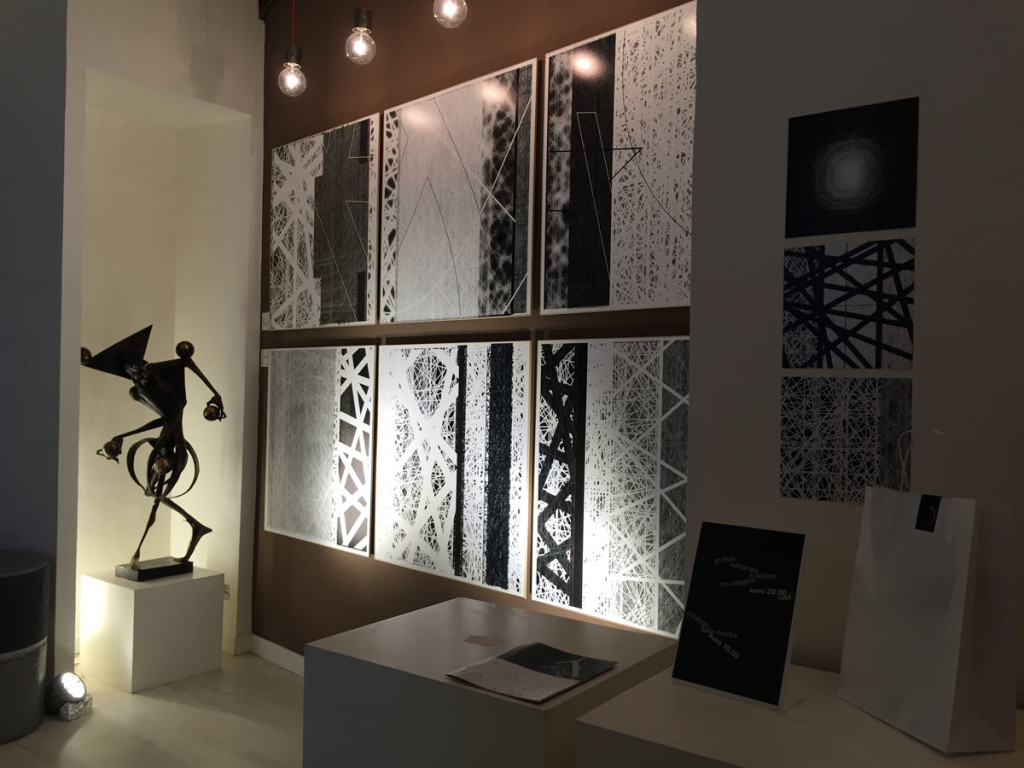
Graphics, design, art, architecture, poetry. All of these are contained within the typefaces of Antonio Pace. Those created by him, metabolized and now released in works that are placed beyond any disciplinary confine. Typefaces are the protagonists of the Outlines exhibition: deconstructed and extricated from any phonetic reference.
The Outlines exhibit refers to the frames defining letters as well as the space. Each work is a different materialization of life defined by the different properties of the materials: the ones of the reflective surfaces, lucid or mirrored, the ones diffused throughout the Led Backlights and the liquid ones of the space in which animation goes into motion where fonts generate original and new patterns found in motion. Letters and words, freed from the duty to form phrases, ask to come into being in experiential forms that are in constant evolution within the subjectivity of the typeface, of its author and of those viewing them.

The alphabet represents an excellent point of arrival in the evolution of our epigenetic landscape: expression of a course the one that flows into the constructed order on conventions temporarily shared. Outlines, questions on the validity of these conventions; it proposes this journey backwards by employing one of the most codified signs, the typographic one. The goal is twofold: On one side it strives to put order a chaotic situation and to work from within suspending rules and hierarchies related to composition and to language. On the other side, it engages in returning the world where they exist as habitable.

Since the invention of the printing press, the printed typeface has proceeded along a great path leading up to the digital dimension. From there on, two new paths opened up: the easy one of the unknowing application of pre-packaged tools and another, more complex one linked to a gradual approach towards letterpress through a conscious process that is an access code to free and subjective creativity. This is the path Antonio Pace chose, beginning with the creation of his original fonts. Once brought into being, they continued (combined with the artist’s own creativity) to the point in which they were not capable of transcending the physical nature of the world – the typefaces, their motion and support material along with printing and exposition methods all worked together to create the desired effect.
The intentions expressed by Pace are that the fonts «therefore return writing to the realm of magic while marks return to their origins and demonstrate a world in its essence, perhaps. An ancient world that points to the future at the same time, not so much with the intention to externalize ideas as much as to exorcize time and imagine accessible dimensions and terrains». This is how the letterpress evades its disciplinary role to cross over into a dimension that swings in and out the realm of art, in and out the realm of architecture – from design and the letterpress itself. Inside and outside the realm of time.
Antonio Pace. Outlines, Spazio Curva Pura, V. Giuseppe Acerbi 1a, Rome, finissage March 28, 2015
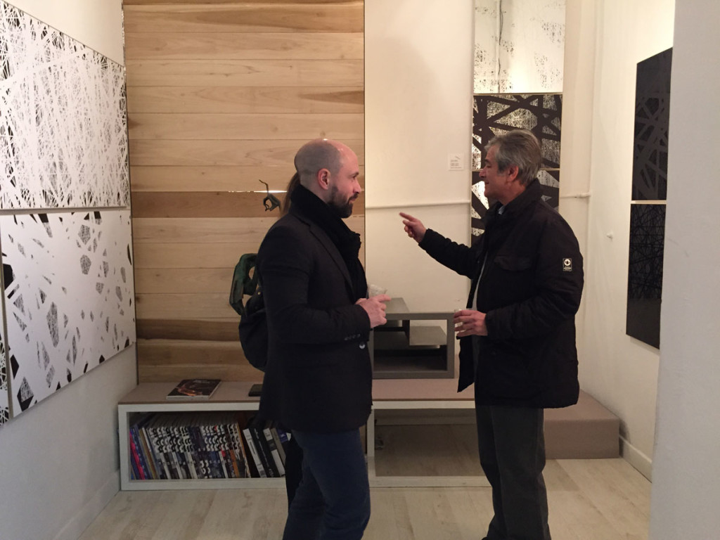
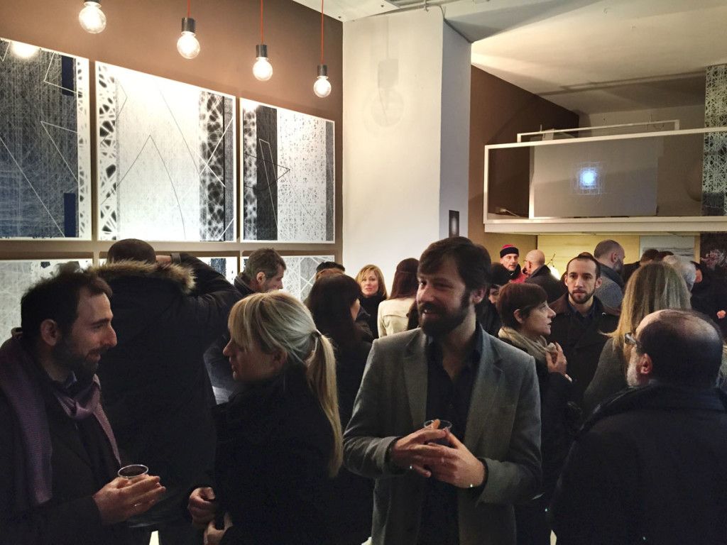
Images (all) Antonio Pace, Outlines, exhibition view, Spazio Curva Pura, Rome


